Social MediaBrandingEmailingSocial MediaBrandingEmailingSocial MediaBrandingEmailingSocial MediaBrandingEmailingSocial MediaBrandingEmailingSocial MediBrandingEmailing
Conceptualisation and design of acquisition campaigns for National Geographic España and its brands: Historia National Geographic and Viajes National Geographic
About National Geographic España
National Geographic España is the Spanish edition of the renowned National Geographic magazine, published in Spanish since 1997. It covers science, nature, history, geography, and culture through in-depth articles and striking photography. It is part of the global National Geographic brand, which is known for exploration and storytelling about our planet.
My Role
On the project, I worked on landing pages, emails, and ads for acquisition campaigns. I handled these three areas as a single, connected effort, making sure the messaging, visual style, and value proposition stayed consistent across the entire user journey. This way, each piece reinforced the next, from the first paid impression to the conversion on the landing page and the follow-up email.
Typography
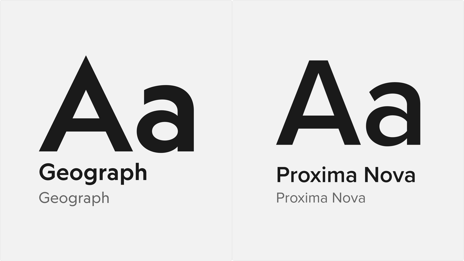
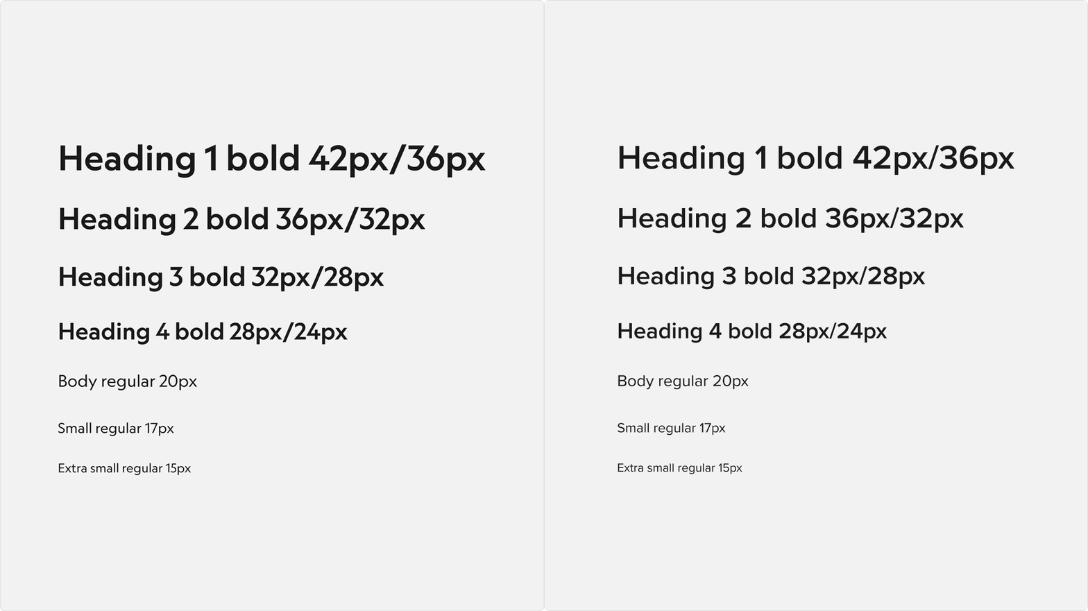
Geograph typography is used in the vast majority of cases, as it is the brand's iconic corporate typeface, and it is mainly applied to image-based formats such as ads.
To ensure optimal loading in web environments, Proxima Nova is used instead. It is the main typeface of the RBA brand, which covers the sale of the magazine and whose online store is where the acquisition landing pages originate. This keeps everything cohesive with the wider brand and avoids reinterpretations by email clients or web browsers.
Landing pages
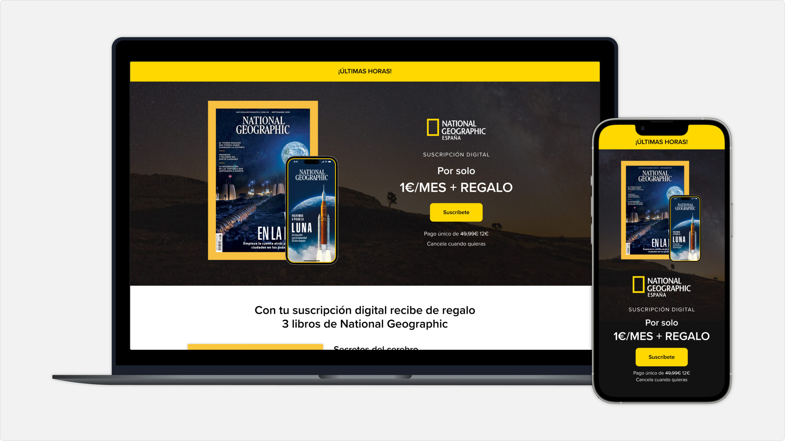
Acquisition landing pages are designed with a clear structure: first the product, the offer, and the call to action, followed by the gift module (if there is one) and the benefits module. A second reminder of the offer comes next, and the page closes with an explanation of how the magazine subscription works.
Paid Media
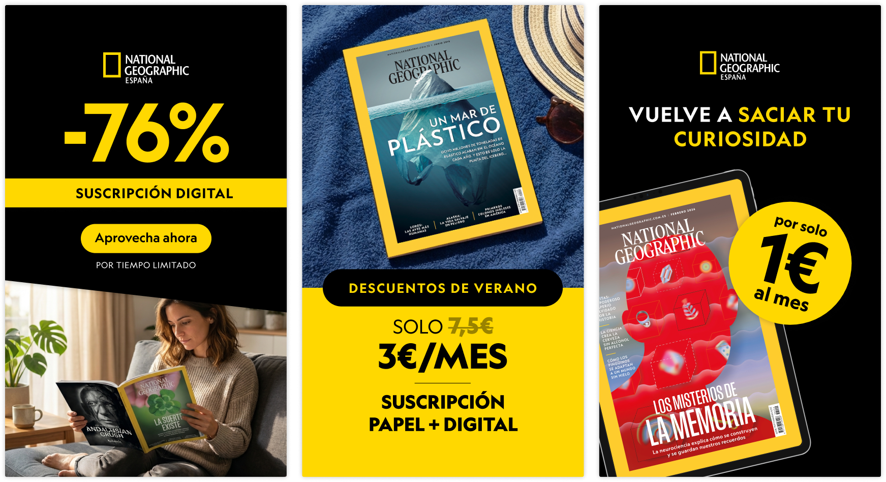
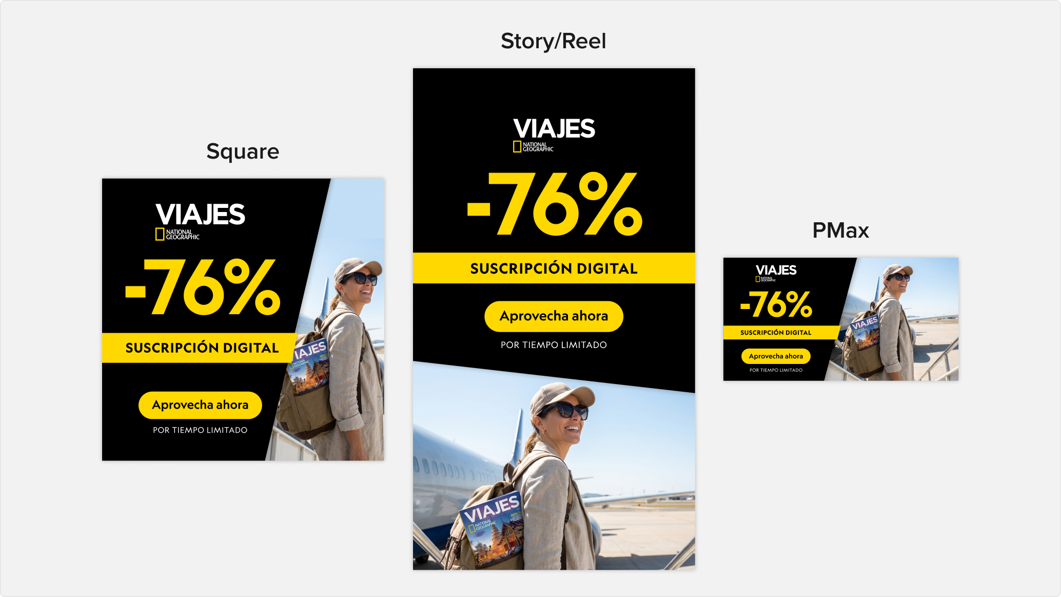
For paid media, I work with square, reel, story, and horizontal formats, with the brand's characteristic yellow and black predominating. In specific campaigns, such as Black Friday or Christmas, the look adapts to the style of the general acquisition campaign shared with the rest of the magazines.
These placements also allow the use of generative AI to contextualize the product more easily, which keeps us at the forefront of marketing and design trend
Emailing
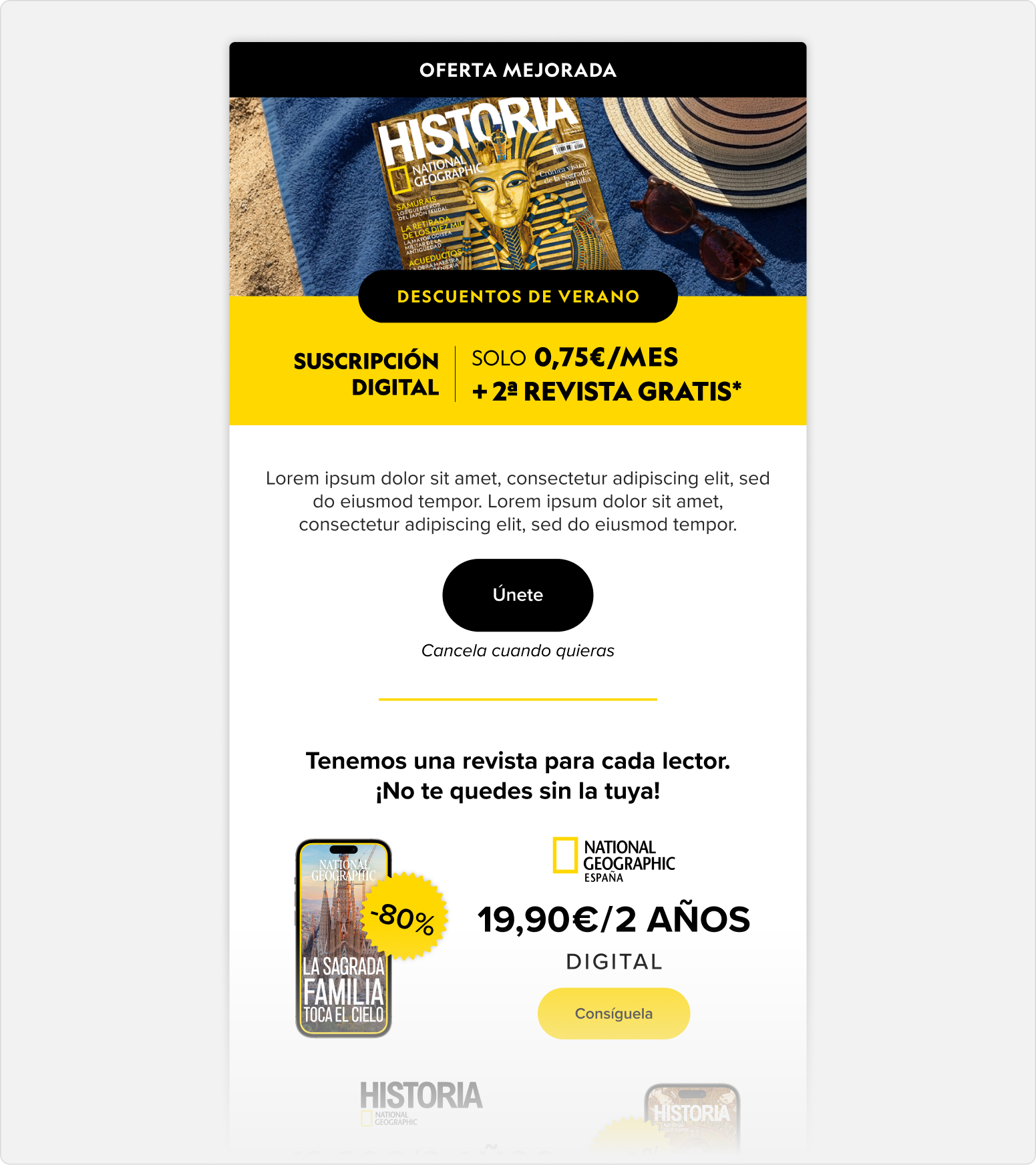
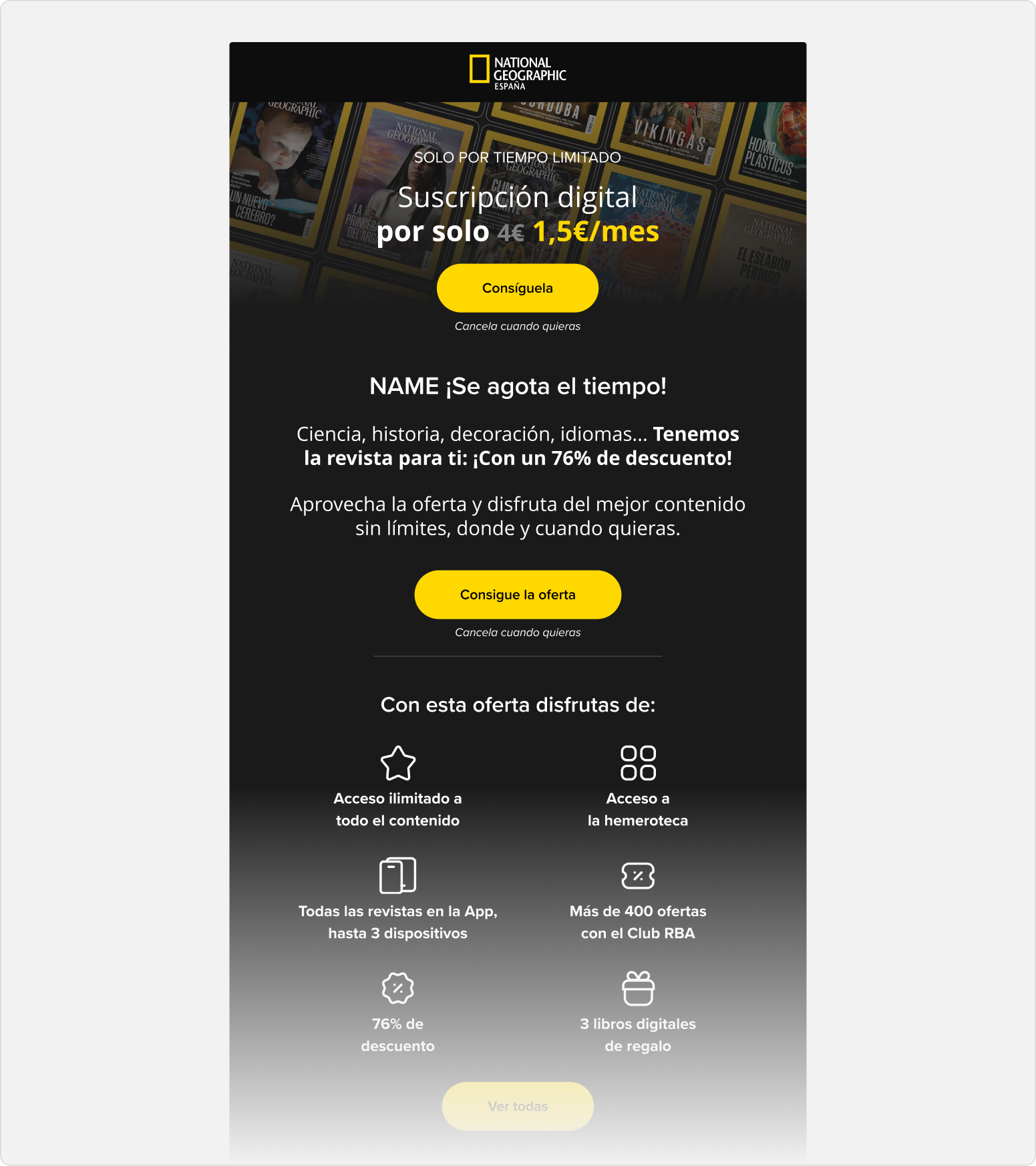
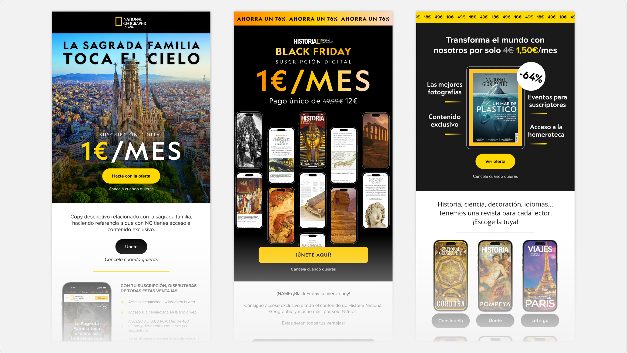
Emails are a key part of acquisition campaigns: they open up new channels for acquisition and loyalty, and they work as a summary of the landing page that brings the offer closer to the user and invites them to take the step toward subscribing. They reinforce the paid messaging, keep in touch with those who haven't converted yet, and increase the likelihood of conversion.
Shall we work on a project together? ☺ → Contact me! Shall we work on a project together? ☺ → Contact me! Shall we work on a project together? ☺ → Contact me!