Doctori.com is an insurance broker and online insurance comparison platform in Spain.
About Doctor i
Doctor i is a Spanish digital insurance comparison platform. It originated from iSalud, an insurtech company founded in 2010, initially focused on health insurance. Today, Doctor i also compares car, motorcycle, life, and funeral insurance.
My Role
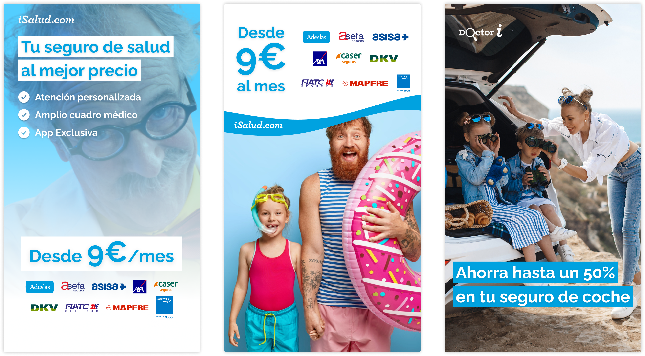
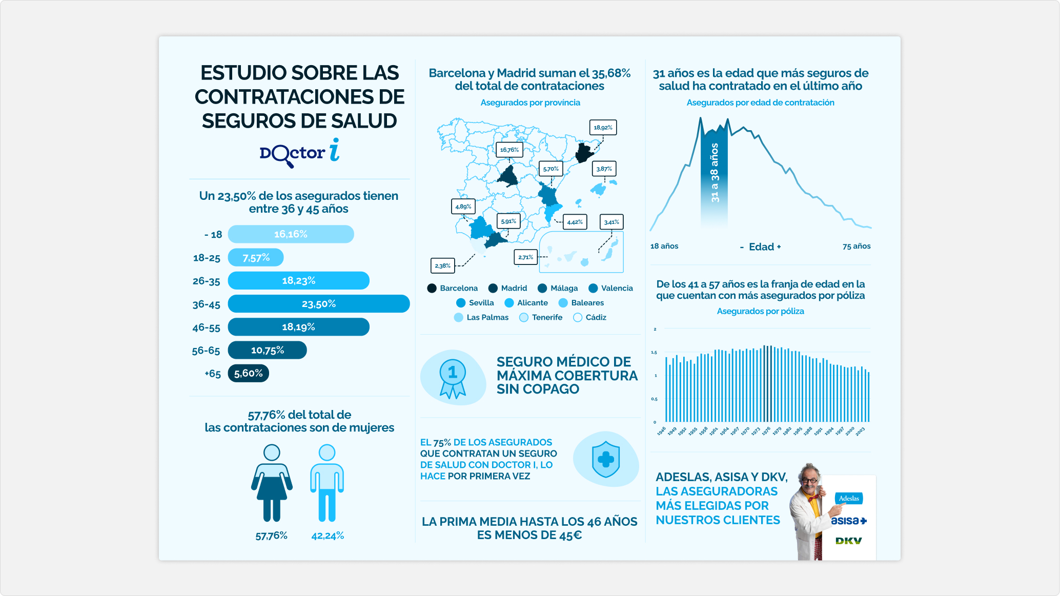
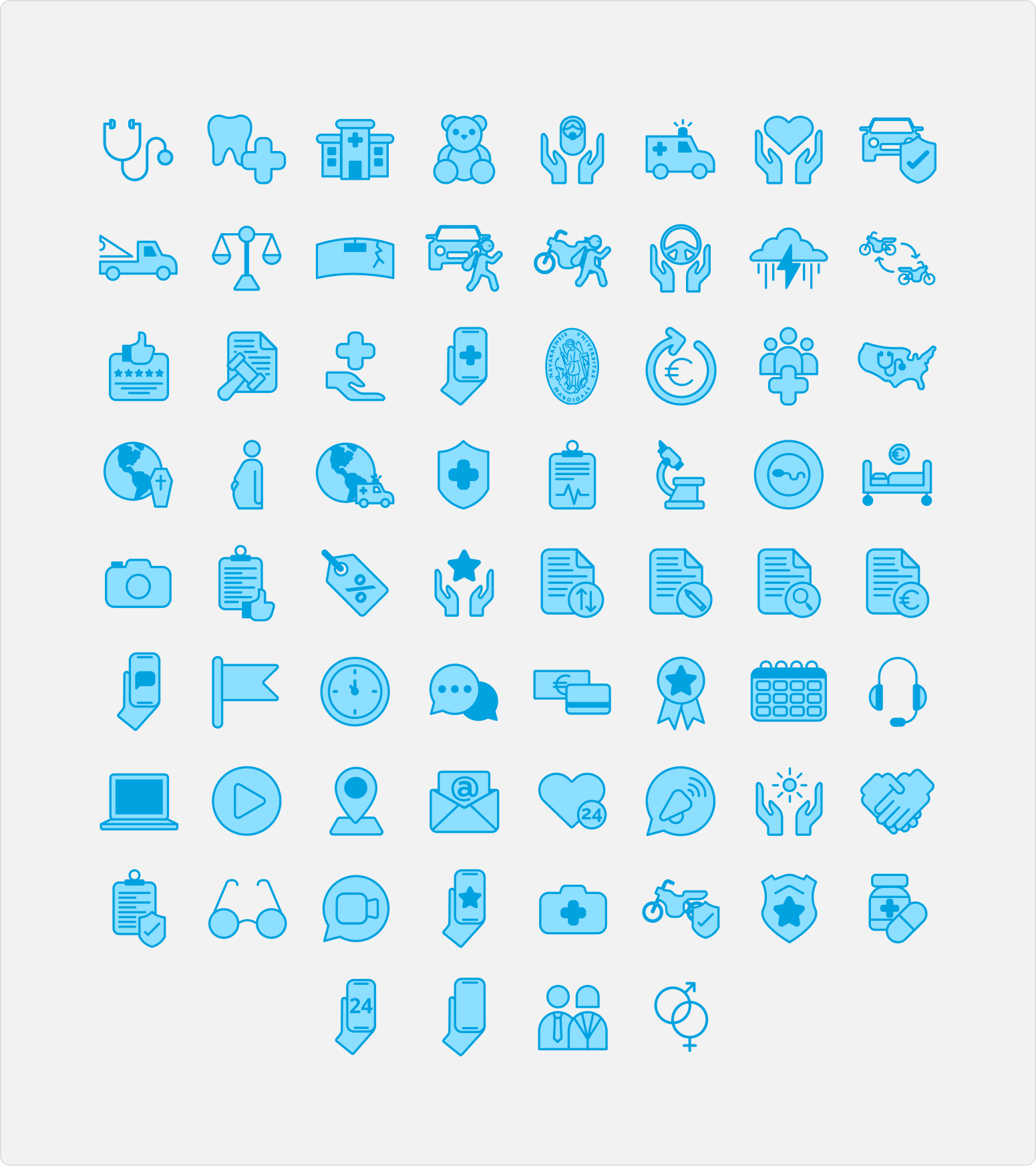
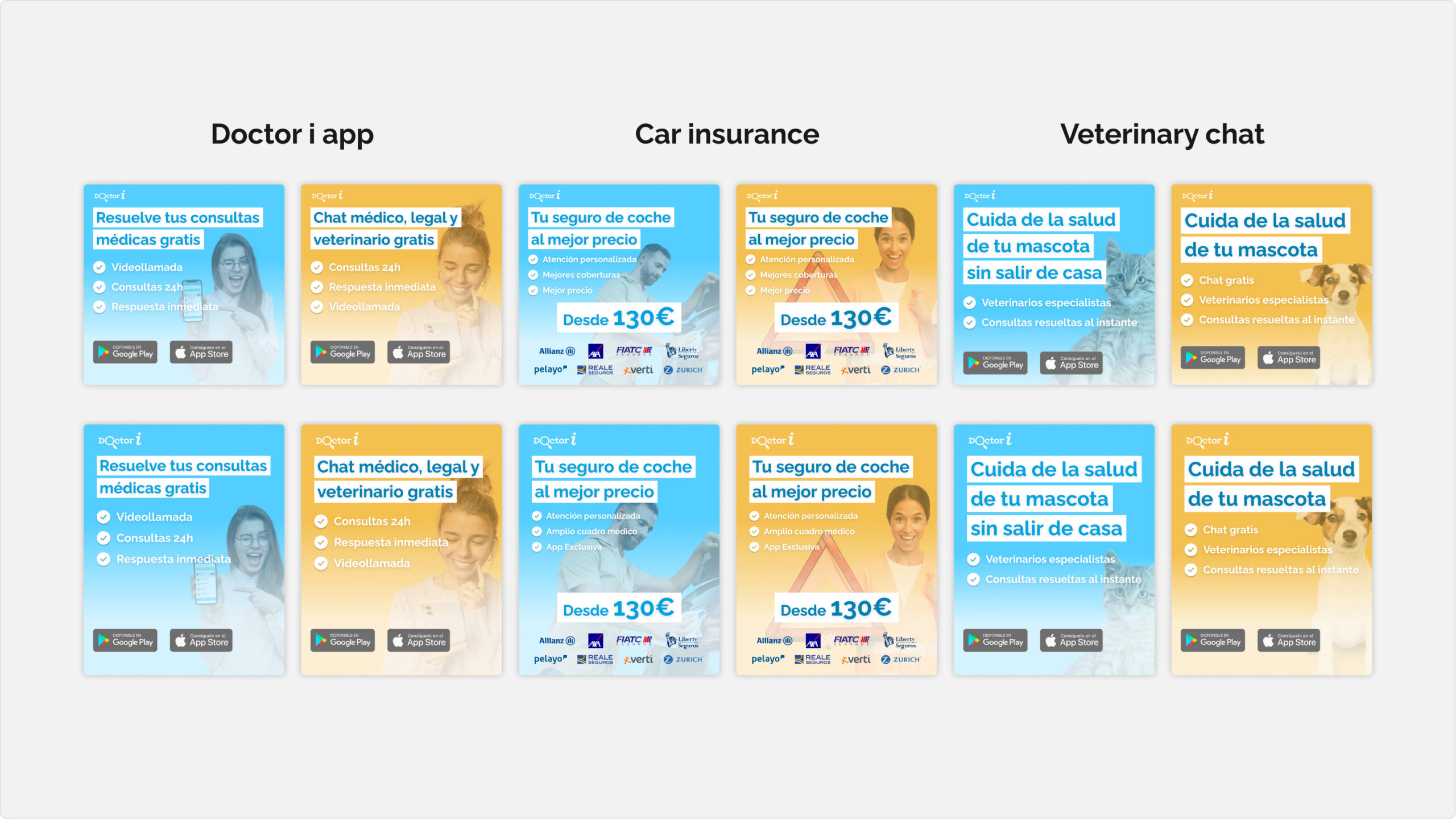
My role as a designer focused on translating and distilling the core elements of the brand’s look and feel into a cohesive digital visual language. This included defining the color palette, typography, iconography, and other key visual assets, as well as establishing the foundations for paid media and social media content. The goal was to create a consistent and flexible design framework that could be applied across different digital touchpoints.
Typography, colors and iconography
In addition to the core and brand colours, the design system establishes a specific colour palette for each magazine, consisting of a minimum of two tones and their respective hover states. This palette is also applied to the collectibles, adapting and expanding according to the visual direction of each publication.
This structure ensures a consistent colour identity across different e-commerce platforms and markets, while maintaining visual coherence across all formats and touchpoints, including websites, creative assets, banners, and physical materials such as cardboards and panels.
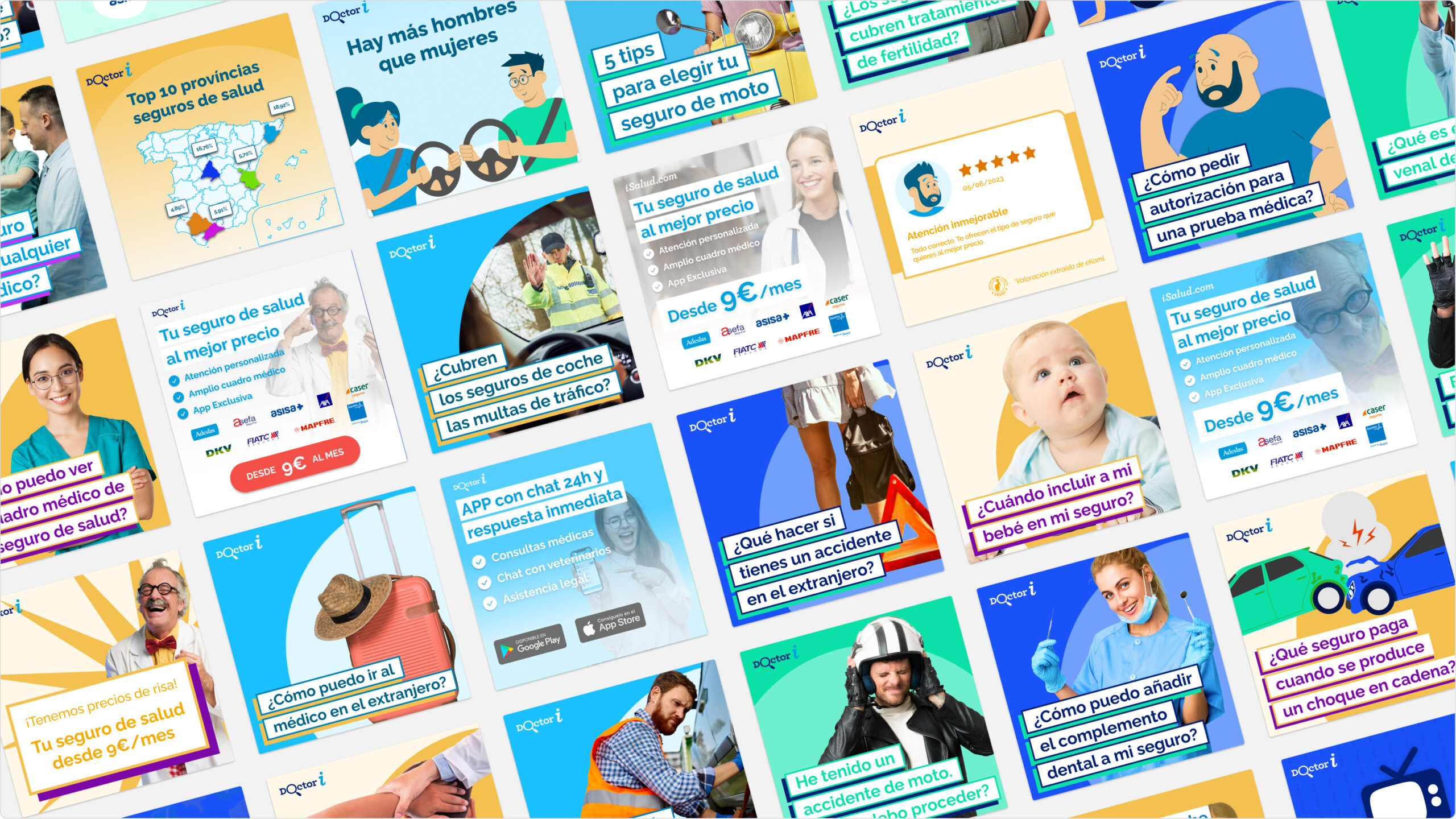
Meta and Google Ads
In addition to the core and brand colours, the design system establishes a specific colour palette for each magazine, consisting of a minimum of two tones and their respective hover states. This palette is also applied to the collectibles, adapting and expanding according to the visual direction of each publication.
This structure ensures a consistent colour identity across different e-commerce platforms and markets, while maintaining visual coherence across all formats and touchpoints, including websites, creative assets, banners, and physical materials such as cardboards and panels.
Social Networks
In addition to the core and brand colours, the design system establishes a specific colour palette for each magazine, consisting of a minimum of two tones and their respective hover states. This palette is also applied to the collectibles, adapting and expanding according to the visual direction of each publication.
This structure ensures a consistent colour identity across different e-commerce platforms and markets, while maintaining visual coherence across all formats and touchpoints, including websites, creative assets, banners, and physical materials such as cardboards and panels.
Shall we work on a project together? ☺ → Contact me! Shall we work on a project together? ☺ → Contact me! Shall we work on a project together? ☺ → Contact me!