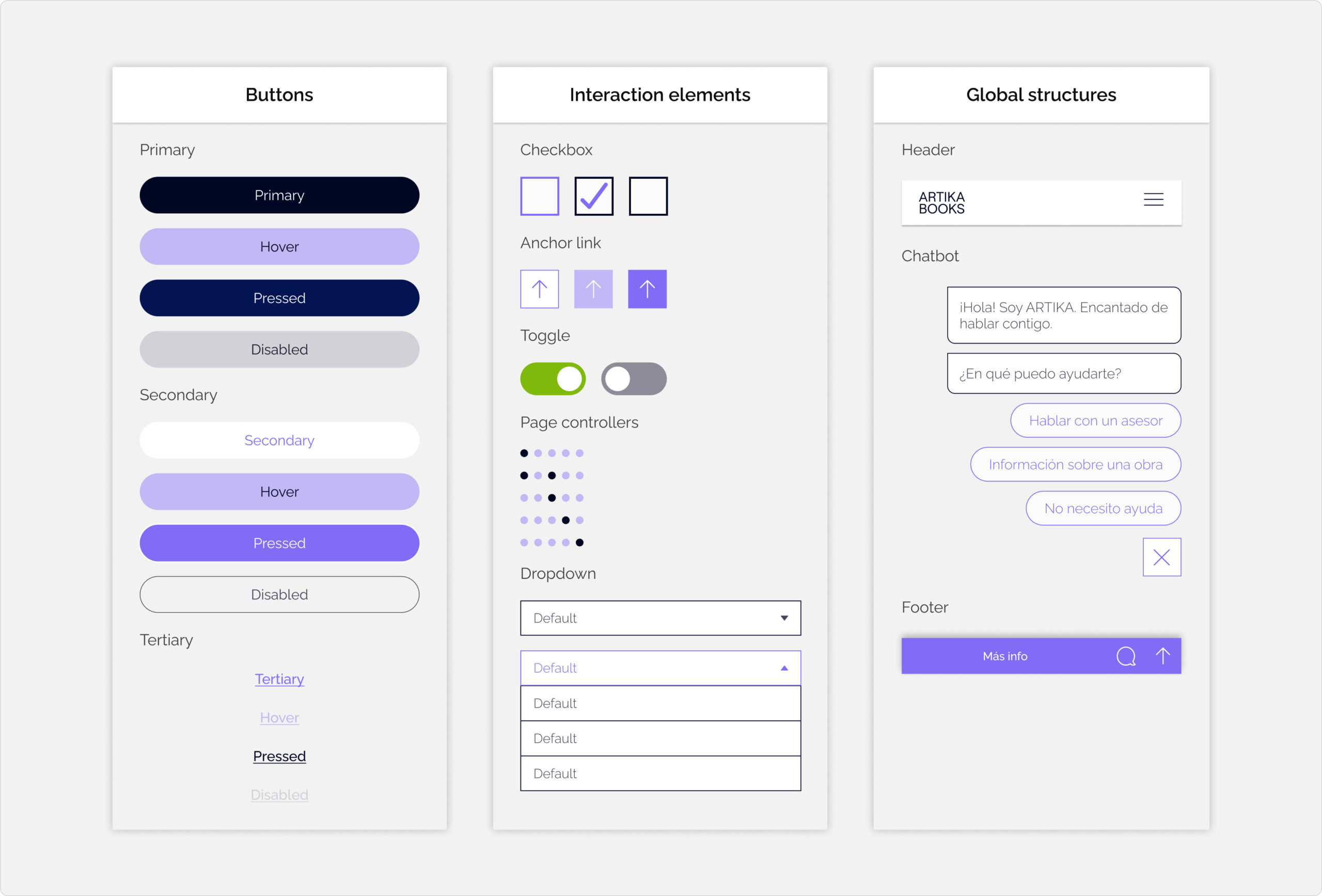
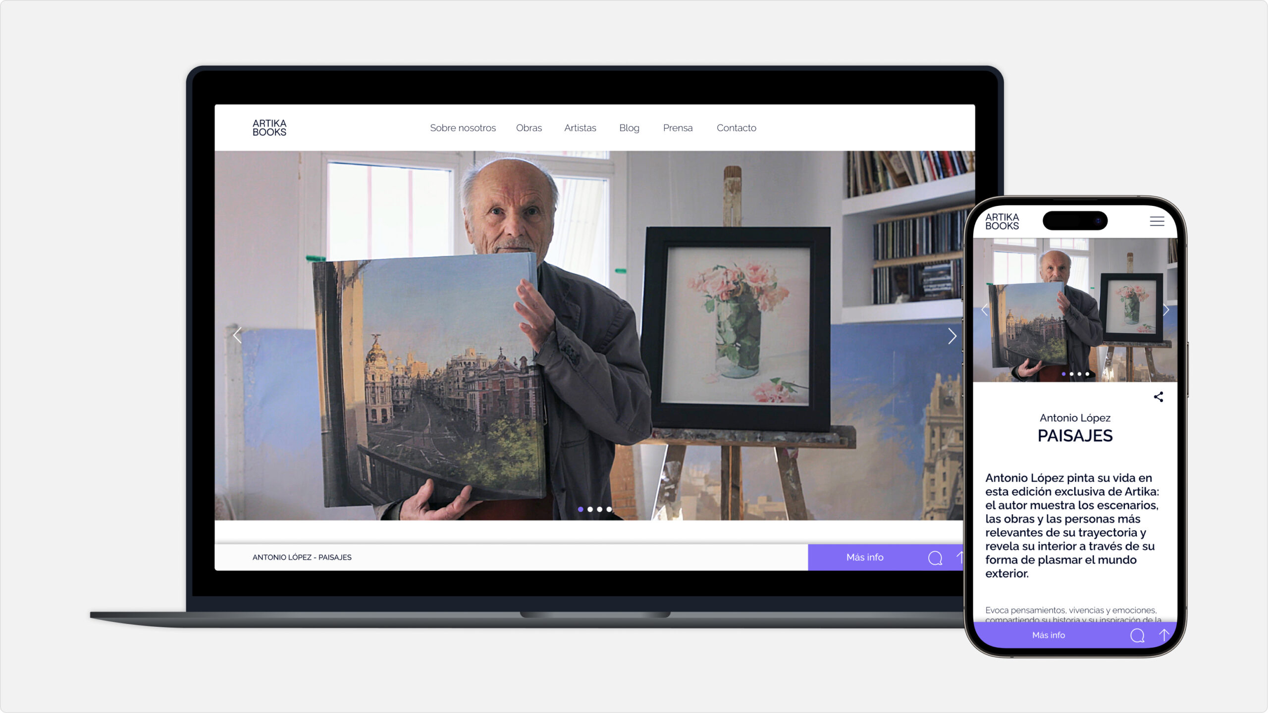
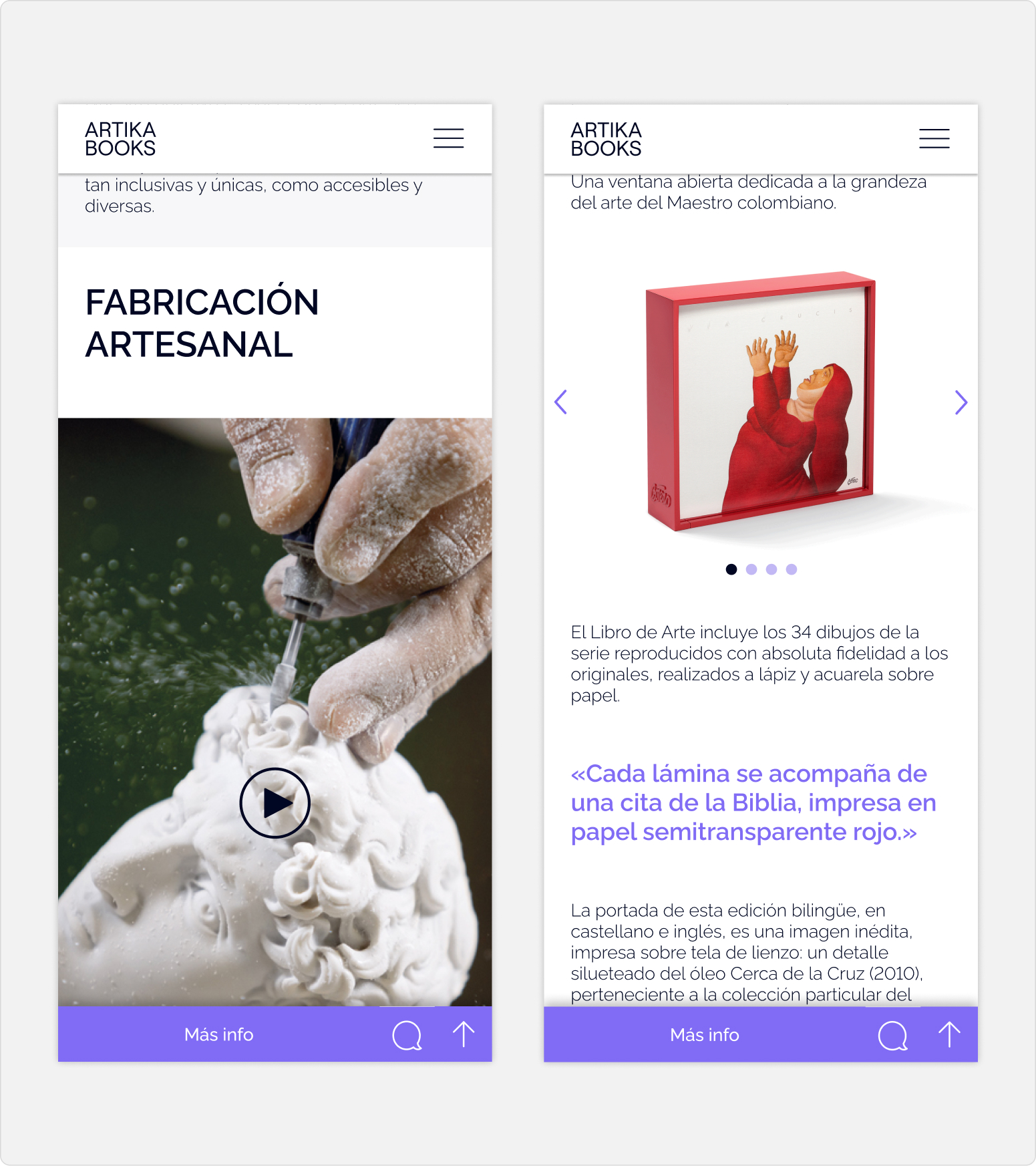
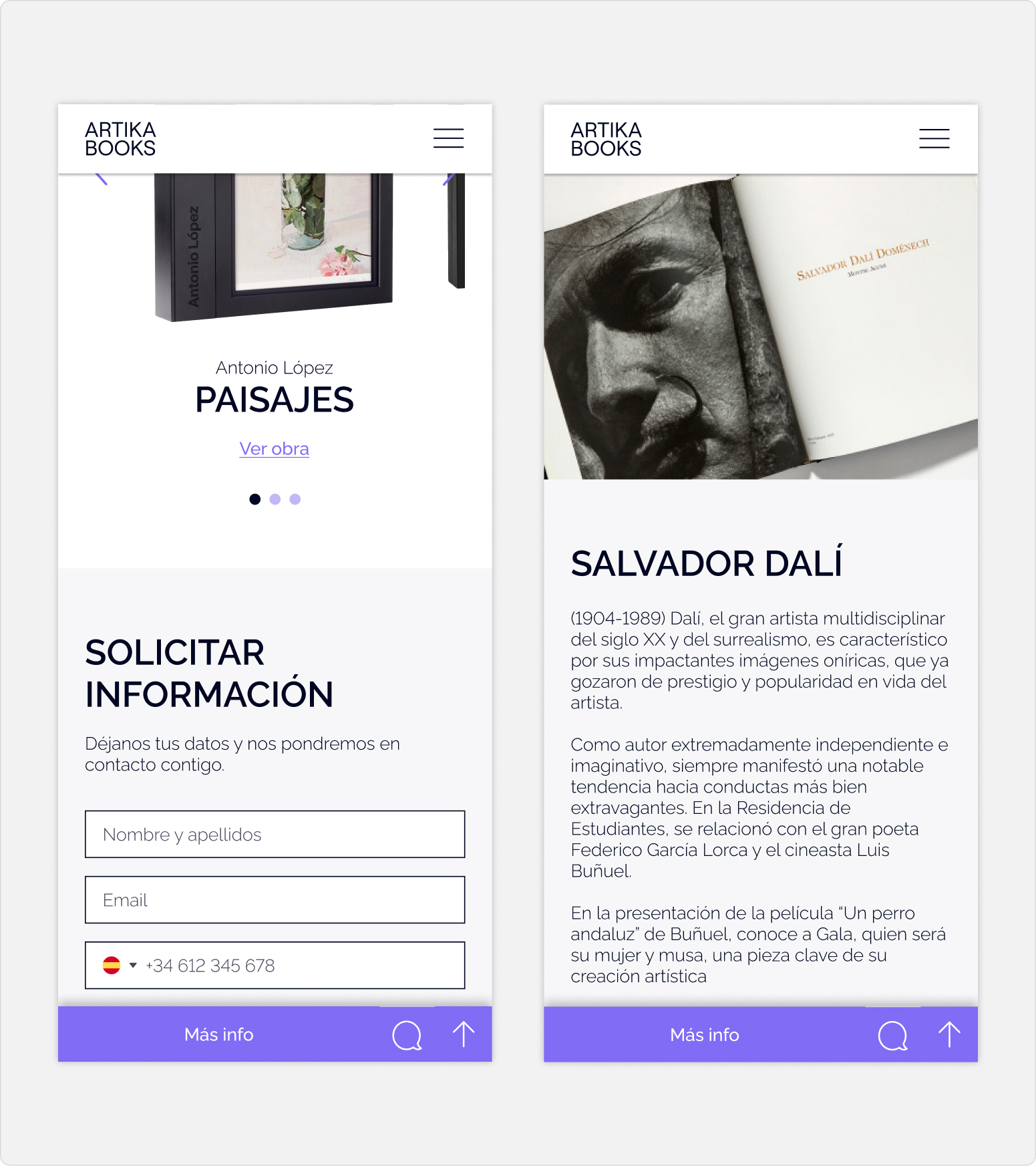
Conceptualization, design and development of the visual identity, design system, website and communications for ARTIKA BOOKS.
About ARTIKA BOOKS
ARTIKA BOOKS is the luxury publishing imprint of Grupo Planeta, specializing in artist books conceived as collectible pieces. A project that brings together publishing, art and craftsmanship through exclusive editions in which the content and the physical object are equally important.
My Role
The existing visual identity had lost consistency and no longer reflected the values the brand needed to convey: luxury, art and collectibility.
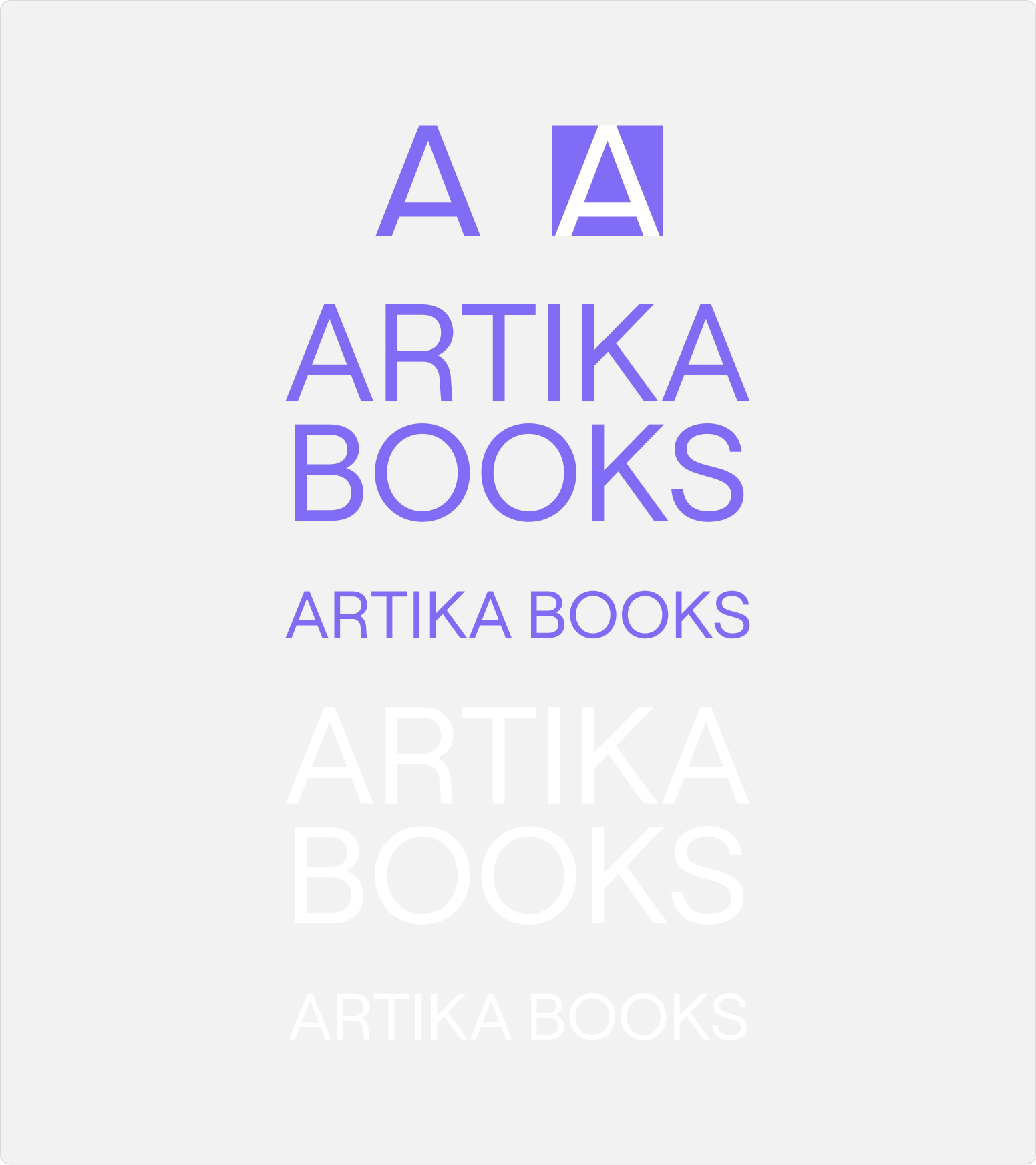
My role was to redefine and develop a new visual identity, refreshing its graphic language without completely breaking away from its legacy. The challenge was to find the right balance between evolution and continuity: transforming the brand’s perception, giving it a stronger personality and building a coherent, recognizable visual system ready to grow across all its touchpoints.
The colors
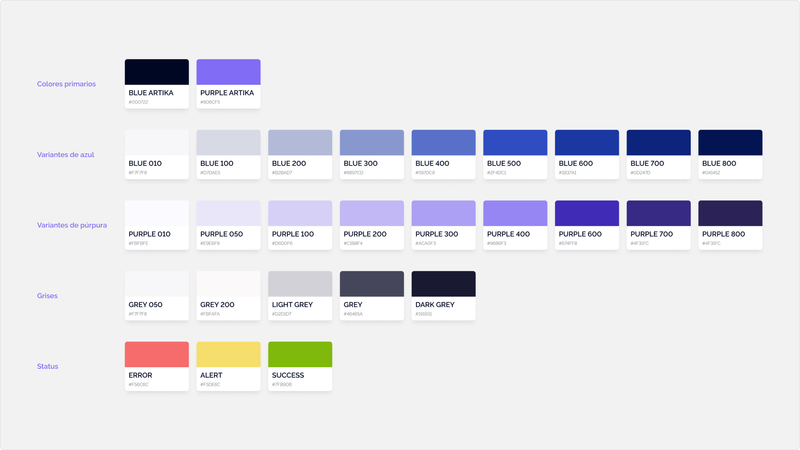
The starting point was BLUE ARTIKA (#000722), the dark blue inherited from the original identity. Based on its luminosity values, I developed a new purple tone (#806CF5) that brings greater expressiveness, softens the coolness of the original blue and gives the brand a more iconic and distinctive presence.
The rest of the palette, including the status colors, was built through variations in the luminosity of the primary purple. This approach maintains overall chromatic consistency while providing the flexibility needed to adapt to different contexts and communication needs.
Typography
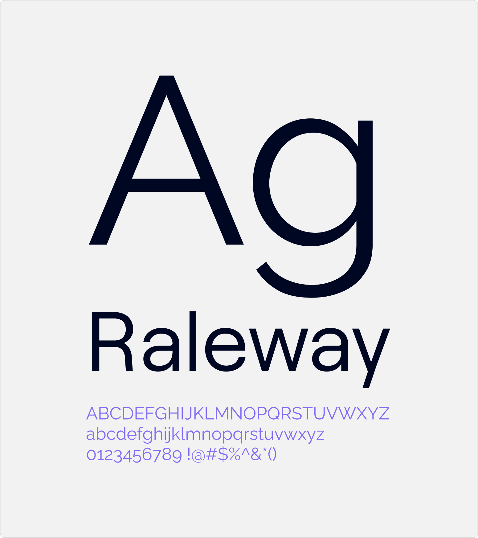
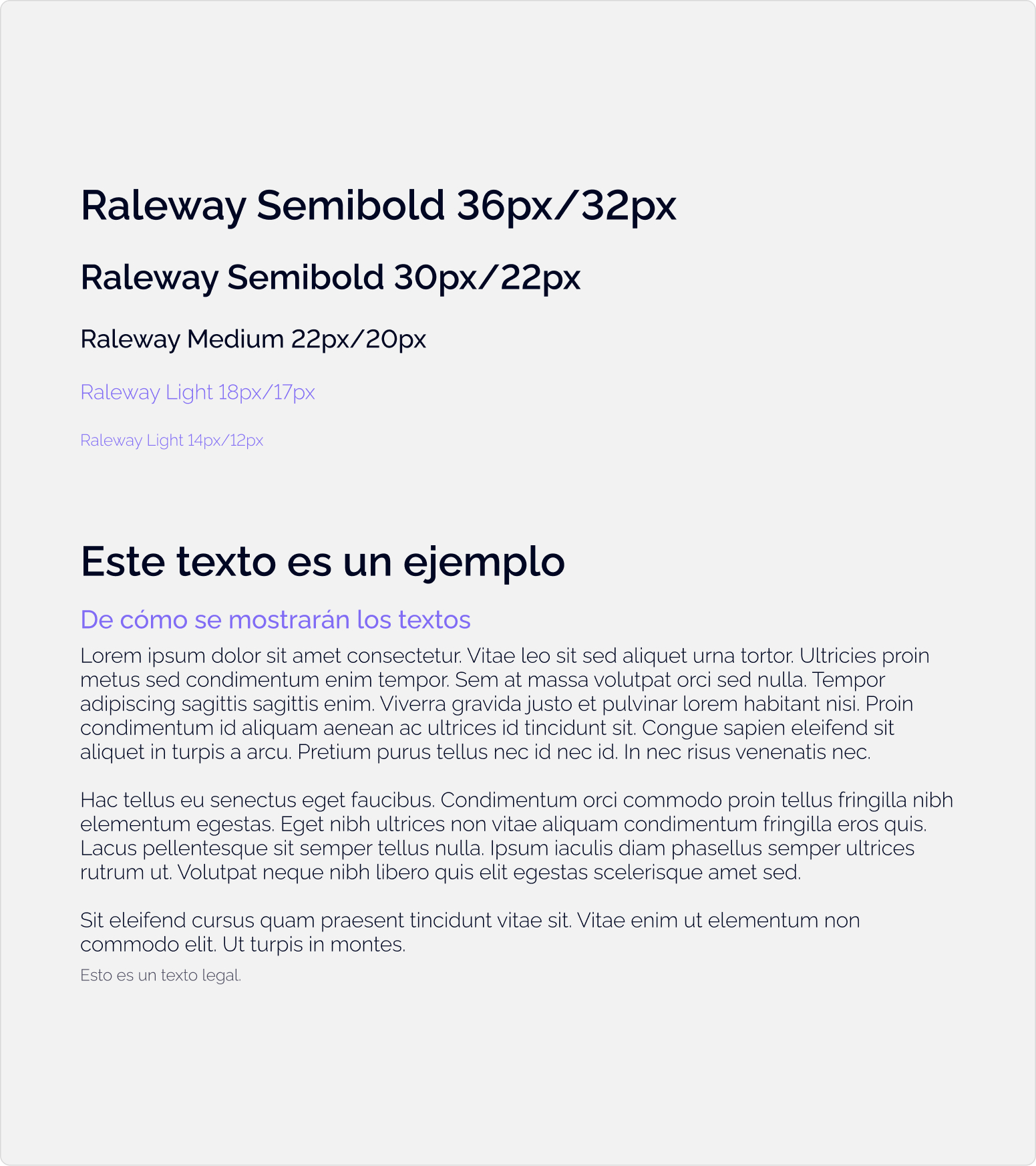
Raleway, a typeface available through Google Fonts, was selected for its contemporary aesthetic and versatility across editorial and digital communication.
Its use makes it possible to establish a clear hierarchy between headings, body text and interface elements without relying on a second typeface family. In addition to providing visual consistency, this approach simplifies the system and supports a consistent, efficient web implementation.
Modules
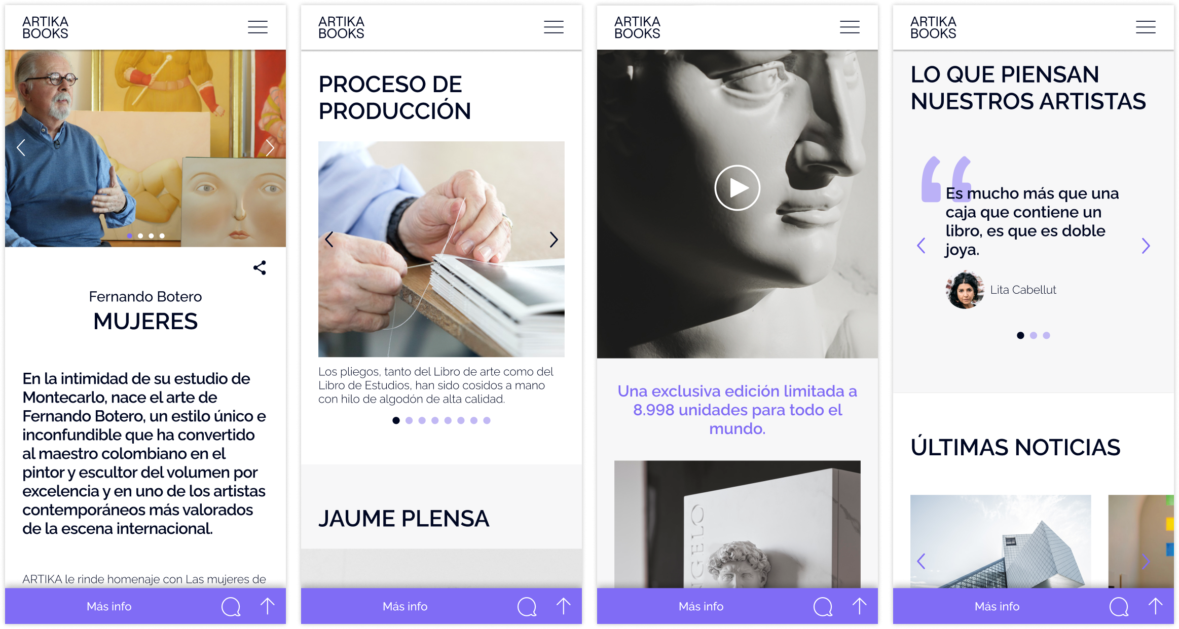
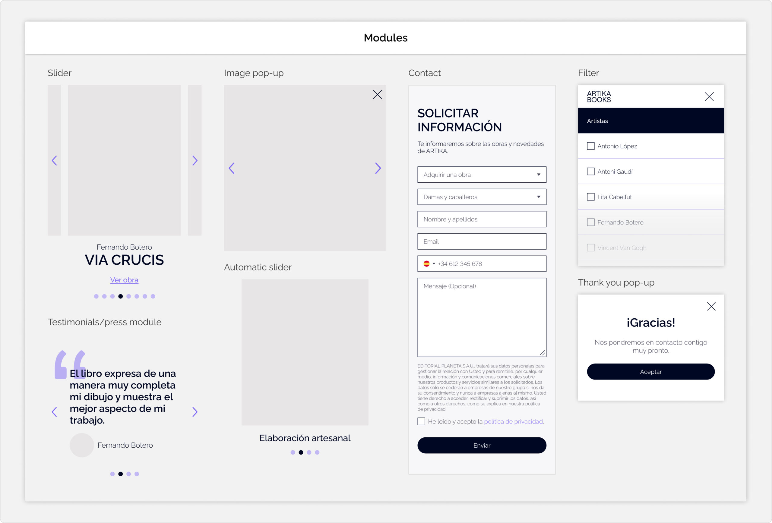
The modular system was designed to prioritize the presentation of the catalogue, editorial information and brand content rather than a conventional purchasing journey, as sales are primarily handled through direct sales channels.
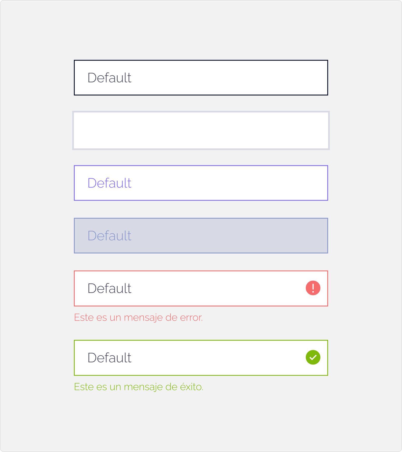
The modules were built around a restrained color palette and a shared set of visual rules, with the aim of giving content prominence, improving readability and maintaining consistency across the website’s different sections and communication materials.
You can check it out at: https://artikabooks.com/
Shall we work on a project together? ☺ → Contact me! Shall we work on a project together? ☺ → Contact me! Shall we work on a project together? ☺ → Contact me!